Indie game storeFree gamesFun gamesHorror games
Game developmentAssetsComics
SalesBundles
Jobs
Tags

qzaf

48
Posts
1
Followers
13
Following
A member registered Mar 26, 2020

Recent community posts

You're welcome! : )

(3 edits)

It might be a good idea for you to do a "Let's play" video running the game, you could then post the video on youtube, the shadowdark reddit, and the shadowdark discord or more to get some exposure?

don't forget to update coverpage #4 to show the updated background.  ; )

(1 edit)

My first party finally made it! I've run 5 sessions and 2 PCs have successfully escaped today! :D (~40 dead PCs)

They earned their Level 1 status and their legendary items from this dungeon. 

Wow! I love this. well done!

Awesome. Thank you

Awesome! Thank you. I love this.

(1 edit)

This is awesome!  After the jam I pray you will do Cleric, Thief, and Fighter! :D  I will pay you money.

100% allowed from what I've seen!

(1 edit)

Ok, I downloaded it and tried it.  We had a question.

  • If all players choose to use the Flee action, is the game completely over or do you keep your gems and get to do the whole setup over again in the hopes of finding more loot? Do you keep your points and delve into a new 'dungeon" and reshuffle the gems back into the deck?
(1 edit)

The artwork is amazing. Excellent job.  Being that there are no random encounters or danger level- I'd love to put this before my players and see how they do!  

Wow! you really did a lot to this since I've seen it last. you got the entire map colored, you made some changes to the PDF that really improve it. excellent job!

The only thing I'd personally like to see changed is to make the page margins narrower to really fill out the page.  This would allow the maps to be bigger and the font to be larger and even easier to read. 

Overall a good adventure that can be plopped down into almost any campaign with only a few hours of prep. It'd be good to keep in your back pocket as a DM if you should need it.

I really like the layout and design. The color choices were bold but they work.  I think the idea of Camp Talents quite a bit. 

I'd love to see an adventure someday in this setting! : )

Useful.

(2 edits)

this is extremely helpful. I 100% will be using this. Thank you for creating it!

EDIT: nice! you updated with a version #2. This is even better knowing you are actively updating and improving it.

Wow! This has everything, goblins, rumors, random encounters, a dungeon, monsters, items, and a Dead Cow! Excellent art work. The map looks great. The layout and design of the pages are excellent.  I love that you used tight page margins to really fit the most into the 8 page limit of this contest.  

I bet you could have filled 8 more! 😅

Looks great. definitely something you should be proud of!

unbelievably great title page. Probably the best I've seen in the whole submission! 

The map itself looks great. the random encounter table looks great.

The one thing I'd change is to spell out that the Danger Level is High.  the text itself spells it out quite well though! "Role for an encounter every 3 rounds of crawling." on page 3. this is a minor and probably stupid quibble.  

Everything else looks great! you should be proud of this.

Looks great. It's a full dungeon adventure.  I like that you included the name generator! that'll be helpful.  I love that you used Dungeondraft. it's my all time favorite map creation tool.

Is there any chance we could get a player-facing map without all icons? 

Definitely Printer-friendly. Packed full of knowledge. I love the little margin notes. tons of useful lore. 5/5. You did an excellent job!

Looks great. I love the art, love the map.  

Any chance we could get player facing maps? (hiding the secret wall icons)

The layout and design of the pages are amazing!

This is the BEST layout of any submission in this Jam. 


I'm normally extremely ink-conscious when it comes to printing but I had to have this in my hands physically. 

Well done sir! 👏👏👏

you certainly packed a lot into 8 pages! I like that you used narrow page margins to really get the most of the page. It's a very printer-friendly pdf. I love to print my resources and hold them in my hand so I really appreciate that. 

Looks good. Well done. : )

The layout and design are really good and fit the theme well!
This would be a fun boss to throw at my players. 

Thanks for making this. I like it!

Wow. The monster stat blocks are very fair considering the party level.  The hexcrawl is well drawn, the maps are isometric.  It was an interesting choice to not have random encounters or a danger level in the dungeon.  I'd love to bring this to the table for my players and see how they do!

Thanks for creating this, it looks good.

Wow! That's some next-level thinking. I was unware.  Jolly good. 

oh ok! I thought you were being folksy saying "homebrewery" I didn't know that was some sort of template or program that does the layout and design.  I understand now. Thank you.

agreed

Wow. This is beautifully designed. Excellent layout.

I love life-path systems in games so this is a 5 out of 5 for me.  Useful and beautiful.  

Great Job!

5 out of 5 for the layout and design alone.  BEAUTIFUL. 

The only thing I'd love to see is a printer friendly version that is mostly white with black text.  I love printing out my resources. : ) Great job!

page 14's "Add +3 when in total darkness" is absolutely genius and should become the standard for adventure creation in not just ShadowDark but every Fantasy TRPG!

I might be overlooking it but what is the Danger Level of this adventure?

Love seeing 1 page dungeons! good job.

Very good job keeping the vibes of Shadowdark and the "look" of Shadowdark in the pdf's layout and design. 

Personally I'm not a fan of the font used on the title. But, everything else looks great.  I might bring this to my table if I have some mass combat.

Easy to read, clean layout. meets the page limit for the contest. Well done.  

You might want to read the Shadowdark License and include the required text of "You must include the following in yourpublication:"[Product Name] is anindependent product published under theShadowdark RPG Third-Party License andis not affiliated with The Arcane Library,LLC. Shadowdark RPG © 2023 The ArcaneLibrary, LLC."

looks good. but it's 12 pages when the rules state a maximum of 8 pages.   These are DENSE pages too.  Why not try making the page margins more narrow and seeing if that slims it up?

(3 edits)

Things I love: 

  • There is a lot of content and world building here.
  • The inkerate map looks good.

Things I don't love so much: 

  • there is no printer-friendly version for us ink-conscious folks? 😅
  • I'd like to see the page margins narrower so the font can be made larger? 
  • Looks too similar to a 5e adventure in layout and doesn't make use of the "Designed for Shadowdark RPG" image I've come to expect on the title page.  The design/layout could use some work to be more inline with Shadowdark's vibes. 
  • Metric system. I love it for science but it doesn't feel medieval fantasy to me. "My horse is 8 heads high and my arm 3 feet."  metric feels too scientific and clean for peasant folk.


Looks good otherwise. Solid 4 out of 5 imo.

Looks good! Lots of weapons to choose from. 

any chance those of us that are ink-conscious could get a printer-friendly version without the background art? 😅

(1 edit)

I love that all the information is on one page. It's concise and quick. Excellent job. 

one question, why is there an extra blank page at the end of the pdf?

(6 edits)

Things I love about it

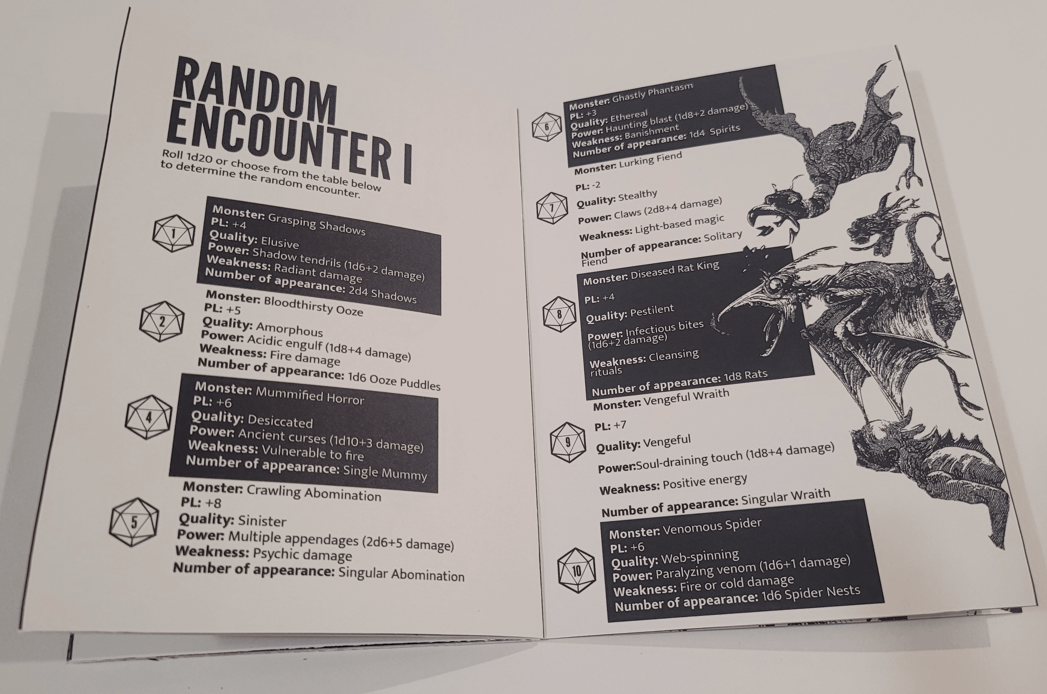
  • Every monster stat block has a brief description AND a quote about the monster from an in-universe character.  This something I absolutely LOVE to see in bestiaries as I often photoshop out the stat blocks and just give the descriptions to my players IF they spend in-game coin to buy an in-game bestiary from a merchant. 
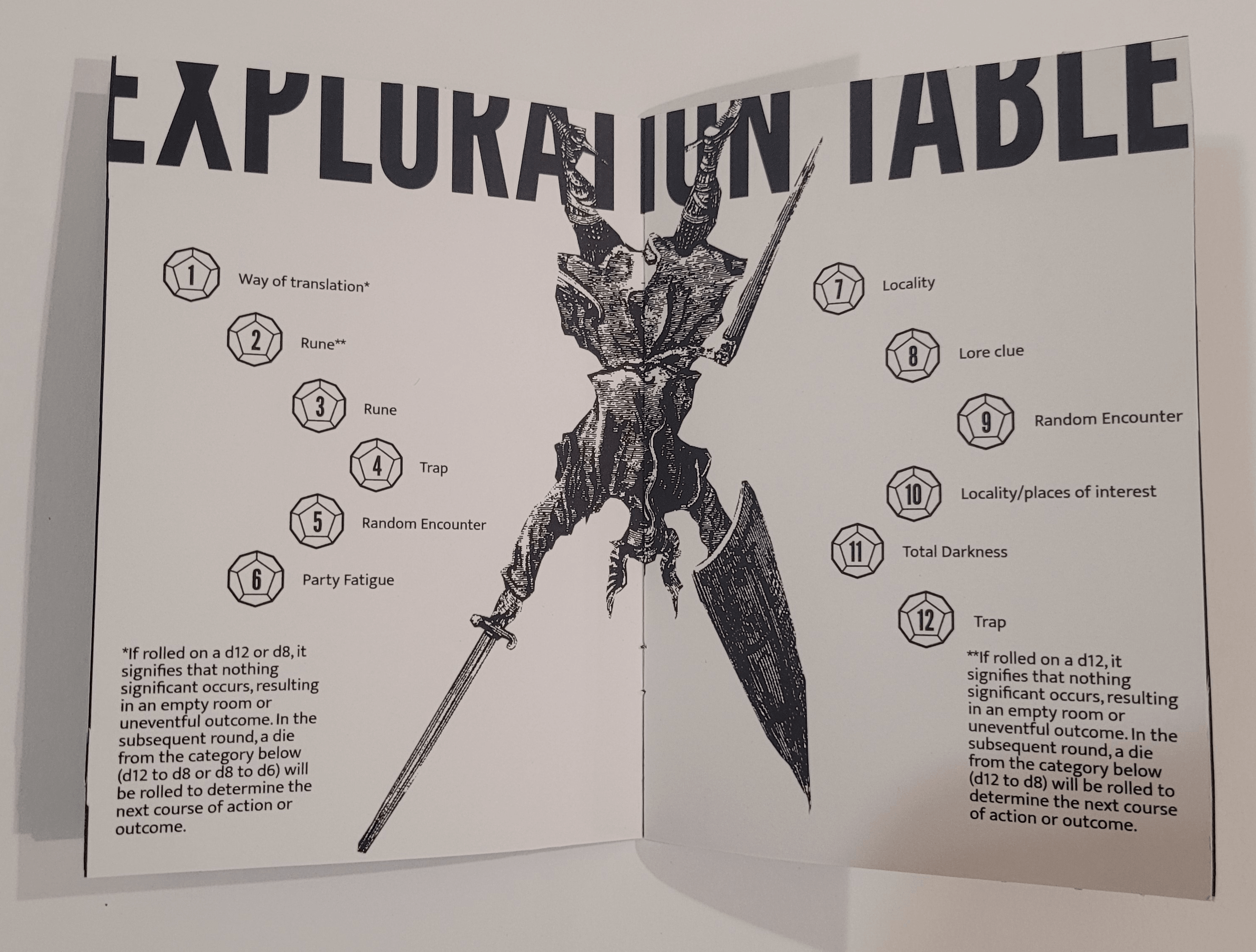
  • The layout/design look great and really fit the Shadowdark theme of pdf design.
  • The art is lovingly made by someone that has passion. 
  • All monster stats are reasonable for low level characters with the only exception being TRAFAWL APES with a whopping 15 HP, three +3 attacks. Even for Level 3, that may be too powerful.
  • The page margins are narrow allowing a lot of information and art on each page!

Things I don't love

  • The art is not on par quality-wise with officially released products, which is understandable considering it's fan-made! It has a homey-feel like a child drew the images.  But, they are still personally below my standards. 
  • The title page could be more avant-garde with it's art style. There is a lot of whitespace.  The fonts chosen for the title and subtitle aren't my favorite. they seem almost "piratey"?
  • The text on page 2 for "A Guide to the Dreadful Critters" seems really tightly squished which makes it difficult to read.

Things I'd like to see someday

  • An additional redesigned pdf that is specifically supposed to be handed out to players. No stat blocks involved. Only descriptions, quotes about the monsters, battle tactic recommendations, and if possible some tactics to avoid combat. Example: "Rainbow snails will generally ignore you if you scatter coins around." or some such thing. I've been in love with Players having handout bestiaries ever since watching Questing Beast's video on youtube about "The Dark of Hot Springs Island" which has an amazing player's bestiary.  

Improvement recommendations

  • The monster stat blocks need to be better laid in an easier to read manner. There is no reason to leave Dexterity dangling at the end of the sentence and have the next one below it start with -1.  

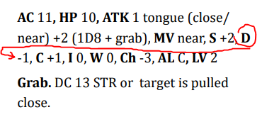
    this happens frequently throughout the pdf. It's especially noticeable on pages 3, 4, and 5.  often a sentence will end with "MV"  and the next will start with "Close".
(3 edits)

Content: 8 of 10.  Great! 
I will be bringing this to my players as an option. 1 point lost for type-os. 1 point lost for "Community Events" being potentially devastating and always negative. I'm not sure why the players should be punished for advancing their Standing within the community. "Thanks for building that orphanage ... did that kid just summon a demon?"

Layout and Design: 2 of 10 Boring.  
Times New Roman font, incorrectly background color "Designed for use with ShadowDark RPG.  The page margin are set to the default setting instead of being very narrow to allow more content on each page. Headers aren't big enough because of this. It's also very noticeable when it comes to the tables not being justified based on the content within the cells, columns, or rows.  Some text needs to be center aligned vertically and horizontally within their cells.   +1 point for the only two images in the pdf being quite good and evocative.